The Largest Curatorial Library
With Responsive Buttons

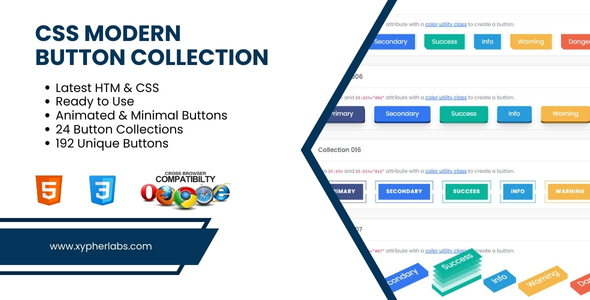
CSS Modern Button Collection

CSS Modern Button Collection

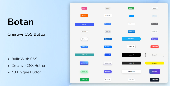
CSS Modern Button Collection CSS Modern Button Collection is a CSS buttons styling script using only HTML, CSS and JavaScript that will give your website, template, or project HTML default button a beautiful shape and styling. The package includes a variety of different button styles, each with its own shape and styling. The package also offers animations, hover effects, and responsive design that adjust to different screen sizes. These buttons are easy to use and setup, with detailed documentation we provided. The buttons are compatible with all modern browsers, including Google Chrome, Mozilla Firefox, Safari, Edge and etc.
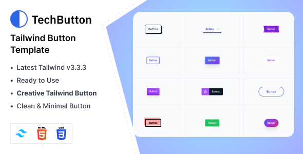
TechButton - Tailwind CSS 3 Button HTML Template

TechButton - Tailwind CSS 3 Button HTML Template

TechButton – Tailwind CSS 3 Button HTML Template, the ultimate Button Style! Crafted with Pure HTML and CSS, this sleek and responsive design offers 45 stunning Button styles. Effortlessly showcase your team or project with ease and sophistication. Experience easy customization and compatibility with Tailwind components, making TechButton the perfect choice for your web project. Don’t miss out on this remarkable team showcase – elevate your website today! The TechButton library features a variety of Buttons, gradients, social login, digital payment integration, and group-related components. It offers raw compiled CSS files for easy customization is a breeze with its developer-friendly code and component-based design, perfect for various agencies and businesses. Integrating the animation is seamless; just copy the code from the source file, including HTML and Tailwind CSS. Main Features:

CSS3 And Bootstrap 4 Buttons

CSS3 And Bootstrap 4 Buttons

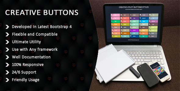
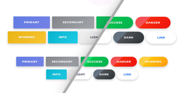
Creative Buttons gives you a remarkable buttons inspiration. The button sets consist of some simple, creative and subtle styles made with Pure HTML5/CSS3/BOOTSTRAP-4 and effects to inspire you. Button’s effect can be when hovering over a particular button or clicking it on. The background animation is a great way for end-users to enhance their nature to fit with a particular colour. The markup of a button is genuinely straightforward. We just add specific shared classes: Code of Class like Button That numbered class are the shared styles for the sets. Each button has an additional specific class then. When using an icon, we add the icon-class which will use the pseudo element :before to add the character from the icon font. The class structure is used for demo purposes. I hope you enjoy the styles and find them inspiring!