The Largest Curatorial Library
With Navbar

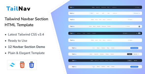
TailNav - Tailwind CSS 3 Navbar Section HTML Template

TailNav - Tailwind CSS 3 Navbar Section HTML Template

Introducing TailNav – Tailwind CSS 3 Navbar Section HTML Template – that will elevate your navigation experience. With a modern and responsive layout, complemented by stylish gradients and captivating wave effects, TailNav promises a visually stunning and immersive interface. Its clean design allows for easy customization, making it the perfect choice for personal profiles or business landing pages. TailNav, designed with the latest Tailwind CSS v3 framework, seamlessly blends sophistication with functionality. Whether you’re crafting a personal profile or a professional landing page, TailNav offers effortless customization. With compatibility across browsers and devices, TailNav ensures a smooth and engaging user experience, presenting your content in a contemporary and visually appealing manner. Choose TailNav to redefine your online identity, presenting a sleek design and modern aesthetics that leave a lasting impression Features:
CSS responsive Menupack

CSS responsive Menupack

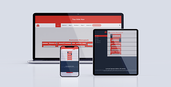
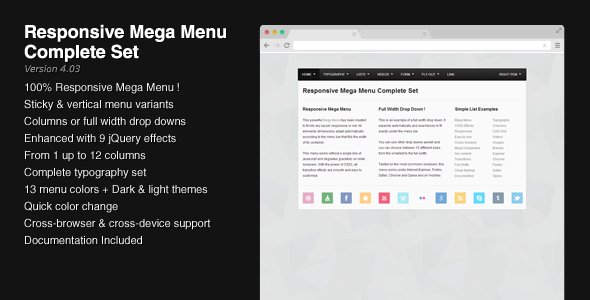
CSS Responsive Menupack is a responsive Menubars which you can use in your website by adding the CSS and JS file in your website’s folder. It’s made with HTML5, CSS3 and jQuery as per required. No Bootstrap or any other framework used. For this, it’s really easy to use. It’s totally responsive for all devices. The Tablet break point starts from 992px and mobile breakpoint starts from 767px. It’s well documented and well commented in CSS. So, the users can quickly edit the css files and you can also add your own background colors as your need and the color changing infor you will get in documentation. Here have 5 types of menubar.

Insha - Css3 Responsive Sidebar Menu

Insha - Css3 Responsive Sidebar Menu

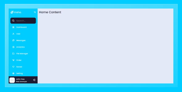
Insha – Css3 Responsive Sidebar Menu, there is 1 type of creative style with CSS3 animation. You can use it on your web site or anyplace in your project. Clean and elegant for every creative people, corporates, agency, e-commerce, business, portfolio etc. This is utterly customizable and prepared to use during a few straightforward steps by choosing the actual section that you would like to use. HTML5 and CSS3 files area unit valid and well commented. Feel free to contact us at any time. We have a dedicated team to provide you the best support. You can contact us via Theme-Forest profile or through this email epictheme15@gmail.com. We can solve your issue as soon as possible with high priority. We 100% support you in technical terms or for customization’s.

Full Screen Modal Nav Using Pure HTML and CSS

Full Screen Modal Nav Using Pure HTML and CSS

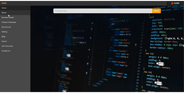
Basically, there is a button you will see at first. When you will click on it a box will appear with full-screen size, the box contains the nav. The nav has a sidebar a top bar, a blank field with a search box. In the sidebar, there are nav items or links and each item has its own image, when you click on any item the image will change on the left blank field. At the top bar, there is a text for showing the menu and a close button to close the popup box. This program is also responsive, in small screen size the sidebar will shift to the top and you have to scroll to see all items.